Community platform changes: Search, navigation, fonts, & more!

CarolineS
Community Manager

Our work to make the user experience here on the community smooth and straightforward continues!


We have just released the following changes:


(1) Search bar moved into the header

Search bar appears after clicking the magnifying glassSearch bar appears after clicking the magnifying glass
We made this change to save some horizontal space and also to align more closely with meraki.com.


(2) Fresh new fonts 

The font is now Roboto, with occasional headers in Sharp, which is in line with meraki.com. Previously the Roboto / Sharp fonts were only on the home page; we hadn't updated the global styles yet.


(3) Bye bye, green horizontal lines!

We've adjusted the styling of the right column of the site; goodbye green horizontal lines, hello light grey boxes with lightly rounded corners! 
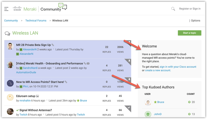
image.png


(4) Nav menu improvements

The hamburger nav now behaves a bit more how you'd expect it to behave - there were some quirks previously with how things opened / closed. Also, any Beta groups that you're in will show up under the "Groups" item


(5) User menu adjustments

Your avatar now shows up in the header - perhaps ya'll will be more inclined to change from the default avatars if you have to look at your avatars all the time 🙂

User avatar in the headerUser avatar in the header


The user menu is now represented JUST with an avatar on mobile:
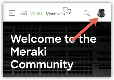
image.png


When you open it, you'll see any notifications / unread messages:
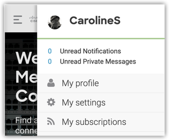
image.png


We hope these changes make your community experience just a bit smoother (though we know that change can be annoying / difficult at first!).


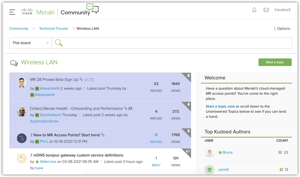
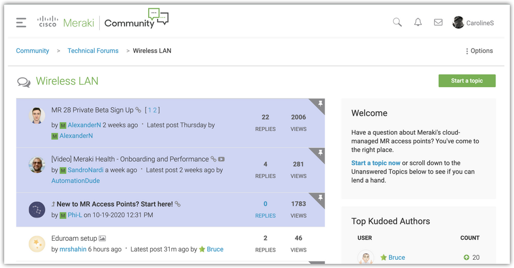
In the spirit of those "Spot the differences" puzzles you may have played as a child:


Spot 5 Differences
image.png image.png


Please do let us know feedback on these changes in the comments below!


Answer to "Spot 5 Differences":

(1) Magnifying glass added to header

(2) User avatar added to header

(3) Search bar removed from below breadcrumbs

(4) Green horizontal lines removed; modules separated (ok, this could be counted as a few separate differences if you want :-))

(5) Fonts are different


16 Comments
BlakeRichardson
Kind of a big deal

Nice work, you missed one spot the difference though, @Bruce has been hard at work and his Kudos hace changed 😆

Inderdeep
Kind of a big deal

@BlakeRichardson Rightly spotted, with a fraction of time @Bruce got 2 more Kudos 🙂 

Bruce
Kind of a big deal

Nice changes - though it strange that the search function had moved, hadn't spotted the other changes. I must've been on a roll....  😀

CarolineS
Community Manager

No wait, Bruce actually has 2 FEWER kudos in the "After" picture! Sorry Bruce!! The leaderboards show a rolling 30 day kudo sum, and I took the "before" picture a couple of days ago... so there must have been a few kudos earned ~31 days ago. 

EJN
A model citizen

I actually like the green lines in the right margin boxes. But can live without... ;o)

CarolineS
Community Manager

@EJN noted! It is a bit monochrome now... maybe we can add back in some splashes of color somewhere. Will ask the design gurus 🙂

EJN
A model citizen

Design is a bit art, so there is always the subjective factor. You almost always have to appeal for the majority knowing that not everyone will like every design element.

DarrenOC
Kind of a big deal

Looking good.


To make the whole experience smoother are you able to incorporate a link from the community back to my Meraki Dashboard and Partner Portal?


Also, the link to the Meraki Community is very well hidden in the Meraki Dashboard.  Just thinking out loud here

kYutobi
Kind of a big deal

@CarolineS YOU ROCK!

Greenberet
Head in the Cloud

@CarolineSnice work =D


I just have one question. When will we get dark mode? =D

CarolineS
Community Manager

@DarrenOC Should be easy enough to add links back to partner portal and dashboard! We can add those to the main navigation, no problem.


Regarding the link from dashboard to the community... there’s quite a lot of competition for real estate on the top bar of dashboard, and we haven’t won yet :). Make some wishes!  

CarolineS
Community Manager

@Greenberet Request for dark mode noted! 

CarolineS
Community Manager

@DarrenOC lookie here! Nav now includes links to dashboard & partner portal! A bit far down the list, but at least they're there 🙂


image.png


Inderdeep
Kind of a big deal

@CarolineS : This is awesome, cool.. Thanks a lot for these changes !

DarrenOC
Kind of a big deal

@CarolineS - ta


Dark mode? 😉 

CarolineS
Community Manager

@DarrenOC dark mode request noted?  😬Probably it won't happen until after our community platform vendor releases a snazzy new frontend update they've been promising for a while (which I believe will be coming out by the end of this calendar year). So.... hang tight?