We're migrating to the Cisco Community on March 29. The Meraki Community will enter read-only mode starting on March 26.
Learn more- Technical Forums
- :
- Dashboard & Administration
- :
- Re: New Dashboard
New Dashboard
- Subscribe to RSS Feed
- Mark Topic as New
- Mark Topic as Read
- Float this Topic for Current User
- Bookmark
- Subscribe
- Mute
- Printer Friendly Page
- Mark as New
- Bookmark
- Subscribe
- Mute
- Subscribe to RSS Feed
- Permalink
- Report Inappropriate Content
New Dashboard
Logged in today to what I am assuming is a forced new dashboard and we'll just have to live with it.
What I don't understand is how anyone thought this was better. Am I the only one?
- Mark as New
- Bookmark
- Subscribe
- Mute
- Subscribe to RSS Feed
- Permalink
- Report Inappropriate Content
What browser on what OS are you using and are you using any OS or browser scaling options, I get this on Windows 11 Edge with 100% scaling
- Mark as New
- Bookmark
- Subscribe
- Mute
- Subscribe to RSS Feed
- Permalink
- Report Inappropriate Content
Windows 11
Chrome and Edge, same issue. Scaling 100%
Incognito mode makes no difference either.
- Mark as New
- Bookmark
- Subscribe
- Mute
- Subscribe to RSS Feed
- Permalink
- Report Inappropriate Content
I'm seeing it on some orgs and not others. Not really seeing a specific pattern at the moment. I would suggest throwing a Support case in so they can confirm if this is a known issue or something new today.
I don't recall seeing this happening until today.
- Mark as New
- Bookmark
- Subscribe
- Mute
- Subscribe to RSS Feed
- Permalink
- Report Inappropriate Content
I am using new dashboard and don't have this issue on MacOS 13
- Mark as New
- Bookmark
- Subscribe
- Mute
- Subscribe to RSS Feed
- Permalink
- Report Inappropriate Content
I have another ORG that I just tested and it's working as expected, so I guess me and my lucky shard?
I'll open a case with support, thanks @Ryan_Miles
- Mark as New
- Bookmark
- Subscribe
- Mute
- Subscribe to RSS Feed
- Permalink
- Report Inappropriate Content
Thanks for checking and opening a case. I've checked tons of orgs/shards and only see it randomly.
- Mark as New
- Bookmark
- Subscribe
- Mute
- Subscribe to RSS Feed
- Permalink
- Report Inappropriate Content
You log in once and you’ve broken it all @NolanHerring 🤣😂
Hope alls well? Been a little while.
https://www.linkedin.com/in/darrenoconnor/
I'm not an employee of Cisco/Meraki. My posts are based on Meraki best practice and what has worked for me in the field.
- Mark as New
- Bookmark
- Subscribe
- Mute
- Subscribe to RSS Feed
- Permalink
- Report Inappropriate Content
- Mark as New
- Bookmark
- Subscribe
- Mute
- Subscribe to RSS Feed
- Permalink
- Report Inappropriate Content
Nice to see you, Nolan, you even if you’re only here to complain! 🙂 (hi! I’m back part-time, filling in for Amy who is on parental leave. Meredith has moved on to a new role at a new company 😭)
- Mark as New
- Bookmark
- Subscribe
- Mute
- Subscribe to RSS Feed
- Permalink
- Report Inappropriate Content
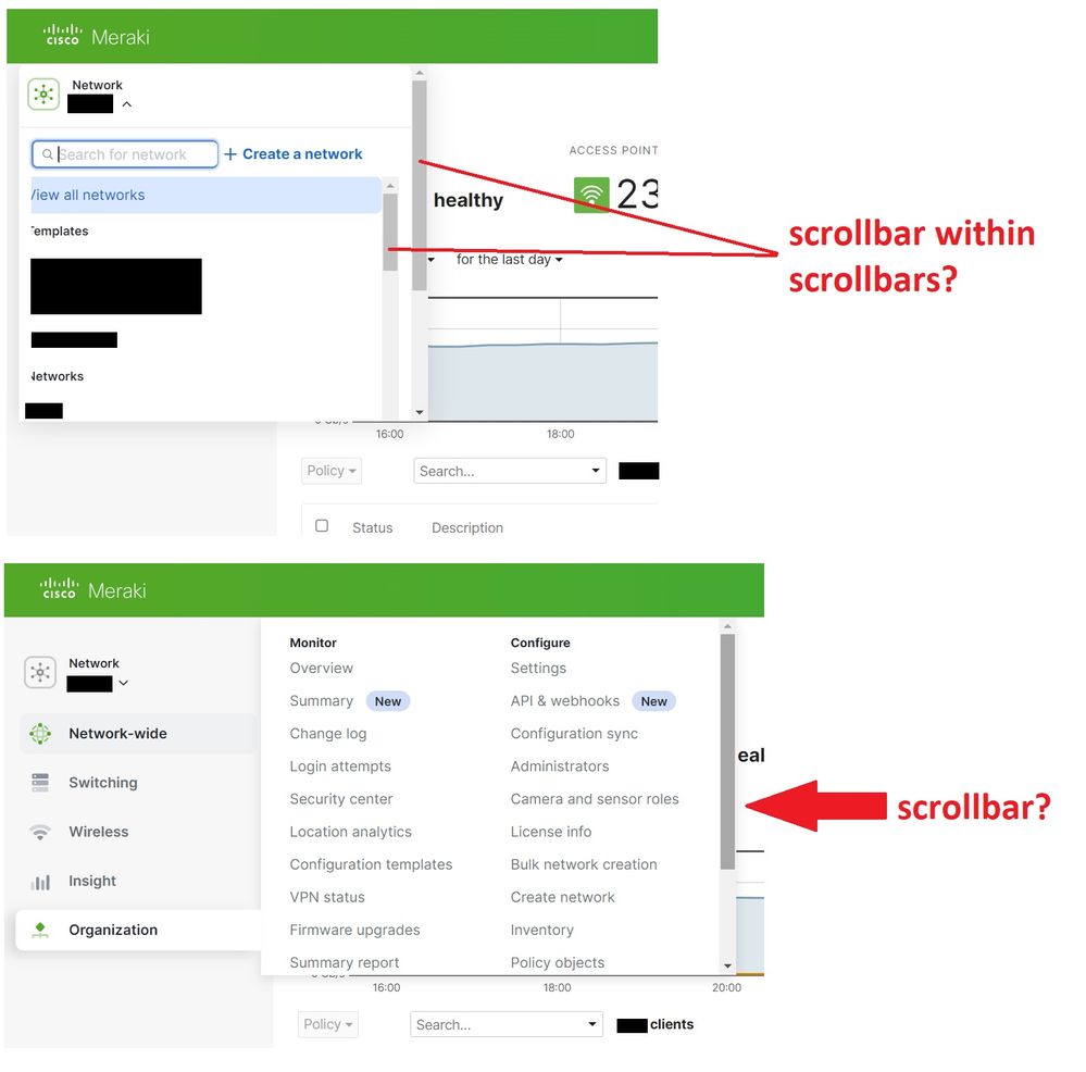
These scroll bars are terrible, who's idea was that ? How do I revert back to the previous dashboard view ?
- Mark as New
- Bookmark
- Subscribe
- Mute
- Subscribe to RSS Feed
- Permalink
- Report Inappropriate Content
I have this problem on the dashboards that use SSO but not on the Dashboard that use the traditional login ...
- Mark as New
- Bookmark
- Subscribe
- Mute
- Subscribe to RSS Feed
- Permalink
- Report Inappropriate Content
Both my ORGs use SAML/OKTA SSO, and only one of them has this issue.
- Mark as New
- Bookmark
- Subscribe
- Mute
- Subscribe to RSS Feed
- Permalink
- Report Inappropriate Content
Meraki support got back to me with a fix:
We have investigated and the reason the issue is occurring, is because of the following Organization setting in the Meraki Dashboard:
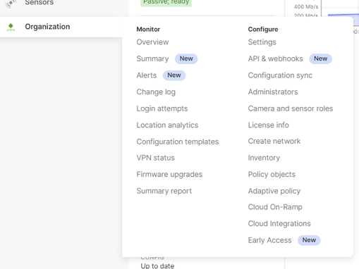
-If Organization > Early Access > 'Dashboard Design System' is NOT set to 'opt-in', then you experience the issue that you are.
-If Organization > Early Access > 'Dashboard Design System' IS set to opt-in, then the issue no longer occurs.
Can you please go to the specific section in Dashboard, toggle the setting to 'opt-in', refresh the page and confirm the issue no longer occurs?
I will raise this issue with our Developers (after I check if it has not already been reported) and let you know what their feedback is.
I believe they may fix something in our back-end systems relating to that specific setting which probably should not even make any difference and is essentially no longer required, as the new Dashboard look and has been rolled out to all customers and is the new look Dashboard, going forward.
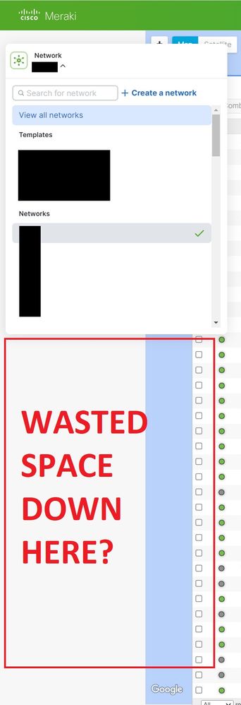
I performed this task and things appear to be acting normal now. One caveat that I re-raised in my case is that when I click the network drop down menu (I have lots of networks), I still get a scroll bar and the window for all the networks is larger than before I fixed this issue, but still seems small to me.
See image below:
- Mark as New
- Bookmark
- Subscribe
- Mute
- Subscribe to RSS Feed
- Permalink
- Report Inappropriate Content
I love the coercion to wanting the new dashboard look, which I personally prefer, but best keep that quiet!
- Mark as New
- Bookmark
- Subscribe
- Mute
- Subscribe to RSS Feed
- Permalink
- Report Inappropriate Content
Yeah that seems to be the key. Thanks for getting confirmation Nolan.
- Mark as New
- Bookmark
- Subscribe
- Mute
- Subscribe to RSS Feed
- Permalink
- Report Inappropriate Content
Otherwise - not sure how I feel about this new layout.
On both wireless and switch page, I now have a scroll bar at the bottom (left/right), whereas before I never had that and I could see everything. I have a 32" 4K screen and in order to remove the scroll bar I have to zoom out to like 75%.
See below, all I did was revert it back to the 'old version', which is just so much simplier.
- Mark as New
- Bookmark
- Subscribe
- Mute
- Subscribe to RSS Feed
- Permalink
- Report Inappropriate Content
How about honoring the setting to not use the new GUI? We looked at it, it was worse than the original and manually switched back. I don't appreciate being forced to use the new one.
- Mark as New
- Bookmark
- Subscribe
- Mute
- Subscribe to RSS Feed
- Permalink
- Report Inappropriate Content
@NolanHerring wrote:Logged in today to what I am assuming is a forced new dashboard and we'll just have to live with it.
What I don't understand is how anyone thought this was better. Am I the only one?
We don't have to live with it. If customers created enough of a stir about it through support tickets, forums, the "feedback" link, and complaints to the account rep, maybe someone would take notice.
- Mark as New
- Bookmark
- Subscribe
- Mute
- Subscribe to RSS Feed
- Permalink
- Report Inappropriate Content
I dislike the new design, not the design itself, but its functionality.
- Loading times have worsened significantly, especially when dealing with multiple devices.
- The sorting feature on the accesspoint/switch overview no longer functions properly; I have to click "sort" and reload the page for it to take effect.
- Previously, all information were displayed on a single table; now, with 30+ devices, one has to scroll all the way down to be able to scroll left/right and than you have go all the way up again.
- When opening the network list on the left side, it doesn't retain the position; it resets to the beginning every time. Cursor up and down is still working but it does not scroll down.
- In the access points table, the connectivity history now only displays one green color, making it impossible to discern if the device was in a mesh state within the last 30 days. This information is only visible on the detailed access point page.
- In the access point/switch overview with multiple pages, the cursor buttons no longer function, requiring scrolling to the bottom and then back to the top again.
I'm certain there are more issues that bother me; these are just a few that came to mind.
This was tested with Chrome and Opera.
- Mark as New
- Bookmark
- Subscribe
- Mute
- Subscribe to RSS Feed
- Permalink
- Report Inappropriate Content
Ok and now I'm officially upset. I just noticed that the wireless page (switch still seems to have old version available to revert to) is forcing the new view.
IT IS HORRIBLE...who approved this?
ALL of the complains that @Alexander3 I am also seeing.
Sorting is broken
Can't scroll right without having to scroll all the way down and back up again
Why do I have to scroll right at all when the old version didn't have to?
@Ryan_Miles @CarolineS - Can you guys PLEASE slap some sense into whoever is in charge of the dashboard because they clearly are not actual users of it.
- Mark as New
- Bookmark
- Subscribe
- Mute
- Subscribe to RSS Feed
- Permalink
- Report Inappropriate Content
I discovered that it's still possible to revert to the old view. However, in some organizations, there's a redirection to the new view, while in others, there isn't.
To access the old view for Access Points, simply replace the URL with the following:
- manage/access_points -> manage/nodes
Alternatively, you can navigate to "network-wide" > "clients" and click on "devices" at the top. It appears that this still uses the old link.
- Mark as New
- Bookmark
- Subscribe
- Mute
- Subscribe to RSS Feed
- Permalink
- Report Inappropriate Content
Bless your heart!
The new wireless access points page is simply terrible, it literally makes me want to find another vendor its so frustrating.
- Mark as New
- Bookmark
- Subscribe
- Mute
- Subscribe to RSS Feed
- Permalink
- Report Inappropriate Content
- you can't search for multiple entries in the table anymore, for example Q2PD-XXXX-XXXX OR Q2PD-YYYY-YYYY OR Q2PD-ZZZZ-ZZZZ
- Mark as New
- Bookmark
- Subscribe
- Mute
- Subscribe to RSS Feed
- Permalink
- Report Inappropriate Content
- When attempting to move access points (e.g., MR20) from one network to another while NBAR is active, and where access points are not supported, the new dashboard displays "There was a problem moving the access points." whereas the old dashboard used to indicate "Cannot add MR20 devices to a network running NBAR. For instructions on how to disable NBAR, please visit here."
- Mark as New
- Bookmark
- Subscribe
- Mute
- Subscribe to RSS Feed
- Permalink
- Report Inappropriate Content
Just back from a week's leave - what is going on with the dashboard ? It's a mess
C'mon Meraki, get it reverted to the previous version, if it ain't broke, no need to fix it - in the words of The Smiths - 'This joke isn't funny anymore'
- Mark as New
- Bookmark
- Subscribe
- Mute
- Subscribe to RSS Feed
- Permalink
- Report Inappropriate Content
Guys - you seem to not understand your role in all of this. The Meraki product team serves at the pleasure of the Meraki product team. Unless you are a very large customer, they don't care a lick about you, your problems, or your suggestions.
When the product team decided it was time to make the new dashboard layout mandatory for everyone, some intern reminded them that many customers had chosen to turn it off. Their response was "So what? We like it."
Make a Wish/Give your feedback goes directly to /dev/null unless your spend level is above a certain threshold. The system does keep count of deleted feedback and displays it on a public board in the HQ office. The product team sometimes looks up at that and laughs as they think about the fools that took time to write out thoughtful comments and suggestions that will never become anything.
Support is trained to "discard cases that cannot be easily solved by suggesting the customer submit feedback." "Be convincing when telling customers that their feedback is valued and taken seriously", the manual says. "Try not to laugh out loud when you tell this to a customer over the phone or it will undermine the goal of getting the customer to go away thinking their issue will be addressed in the near future."
- Mark as New
- Bookmark
- Subscribe
- Mute
- Subscribe to RSS Feed
- Permalink
- Report Inappropriate Content
I've got four freaking scrollbars showing on a 1920x1080 screen, and a very rude Help Centre button. Do you know how painful it is try to scroll the page with the mouse wheel?
The issue is pervasive in many of the other pages, not just this one.
Topology display is a joke. Try browser-zooming in on a path to get the port numbers with two near-by devices. You simply can't. Need to take a leaf out of Figma's Canvas zoom.
No "opt-in" Design feature to switch on that is supposed to resolve this.
(we fixed the VLAN issue in red).
Anyone also suffer from moanfully slow page-load times? We've complained about this multiple times over the years. Deaf ears. So deaf.
-
Administrators
243 -
Change log
15 -
Firmware upgrades
32 -
Inventory
49 -
Licensing
82 -
Meraki mobile app
13 -
Other
180


