We are pleased to announce that, starting tomorrow Monday, April 1, the Meraki Community will have a new look!
For those of you who use the Meraki dashboard, the look and feel should be familiar, since we are using the same design system.
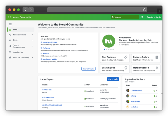
Here’s a quick preview! This is a screenshot from our testing site, so apologies for the thread titles like “Test test test” 🙂
 Preview of Community Home Page with new look & feel
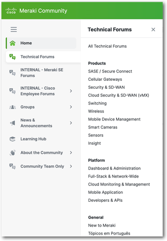
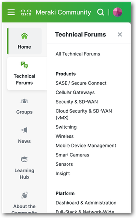
The new navigation is particularly noteworthy - it’s always visible (but can be condensed), and the sub-menus fly out. The navigation also works well on mobile!
 New navigation New navigation |
 New navigation on mobile New navigation on mobile
|
We can’t wait to hear what you think about this once it launches!
ALSO - we will have about 1 hour of downtime for this launch; it is currently planned for Wednesday, March 27 (tomorrow!), starting at 2pm Pacific. Monday, April 1, starting at 2pm Pacific (no, this is not an April Fools' joke! 🤣)
P.S. No, there isn’t Dark Mode. I know you’ll ask. We will be working on that soon!