Get answers from our community of experts in record time.
Join now- Technical Forums
- :
- Dashboard & Administration
- :
- Re: Organisation/Overview map - not showing correct info
Organisation/Overview map - not showing correct info
Solved- Subscribe to RSS Feed
- Mark Topic as New
- Mark Topic as Read
- Float this Topic for Current User
- Bookmark
- Subscribe
- Mute
- Printer Friendly Page
- Mark as New
- Bookmark
- Subscribe
- Mute
- Subscribe to RSS Feed
- Permalink
- Report Inappropriate Content
Organisation/Overview map - not showing correct info
Hi all,
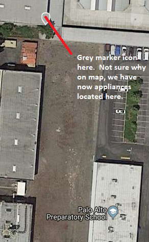
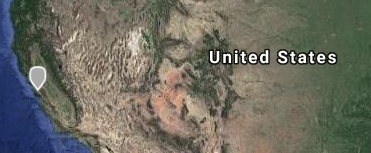
We have a number of sites around Europe, yet - when i click on Organisation overview, map zooms out to show a grey icon over in US near to Palo Alto Preparatory School (we don't have a site there that's for sure).


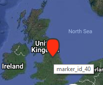
Also, the location icons are labelled up as marker_ID_xx and not Network name or something useful. They are also not showing any info when you hover over them:
Am I missing something obvious in configuring them??
thanks
Solved! Go to solution.
- Mark as New
- Bookmark
- Subscribe
- Mute
- Subscribe to RSS Feed
- Permalink
- Report Inappropriate Content
Not to be to obvious, but you didn't mention if you entered street addresses for all your devices. Once you have done that it should look correct.
- Mark as New
- Bookmark
- Subscribe
- Mute
- Subscribe to RSS Feed
- Permalink
- Report Inappropriate Content
If you look in the network list in the same view - do you see an funny network names?
- Mark as New
- Bookmark
- Subscribe
- Mute
- Subscribe to RSS Feed
- Permalink
- Report Inappropriate Content
Thanks for reply 🙂
I assume you mean unhide table view? - if so, then no, no weird or funny network names, just the ones we've created ourselves.
cheers
Gary
- Mark as New
- Bookmark
- Subscribe
- Mute
- Subscribe to RSS Feed
- Permalink
- Report Inappropriate Content
Not to be to obvious, but you didn't mention if you entered street addresses for all your devices. Once you have done that it should look correct.
- Mark as New
- Bookmark
- Subscribe
- Mute
- Subscribe to RSS Feed
- Permalink
- Report Inappropriate Content
For me the Palo Alto stuff is usually stuff that doesn't have a location set yet.
If this was helpful click the Kudo button below
If my reply solved your issue, please mark it as a solution.
- Mark as New
- Bookmark
- Subscribe
- Mute
- Subscribe to RSS Feed
- Permalink
- Report Inappropriate Content
Sorry for late reply spankym & Adam,
I believe i have set an address for each device, but will double check this and let you know.
Thanks for the input all 🙂
Gary
- Mark as New
- Bookmark
- Subscribe
- Mute
- Subscribe to RSS Feed
- Permalink
- Report Inappropriate Content
Awesome spankym & Adam, that's what it was - I'd missed of the address for one of our sites.
Have added it now and it's moved the grey icon to the correct location.
As spankym was first to reply with solution i've accepted that one (sorry Adam - yours was correct also - should be able to mark all correct solutions 🙂 )
Kudos given to both of you anyway
Cheers
- Mark as New
- Bookmark
- Subscribe
- Mute
- Subscribe to RSS Feed
- Permalink
- Report Inappropriate Content
I'm glad to hear you got it resolved 🙂
If this was helpful click the Kudo button below
If my reply solved your issue, please mark it as a solution.
- Mark as New
- Bookmark
- Subscribe
- Mute
- Subscribe to RSS Feed
- Permalink
- Report Inappropriate Content
- Mark as New
- Bookmark
- Subscribe
- Mute
- Subscribe to RSS Feed
- Permalink
- Report Inappropriate Content
Thanks for that update Shanec - will await the result of their investigation 🙂
- Mark as New
- Bookmark
- Subscribe
- Mute
- Subscribe to RSS Feed
- Permalink
- Report Inappropriate Content
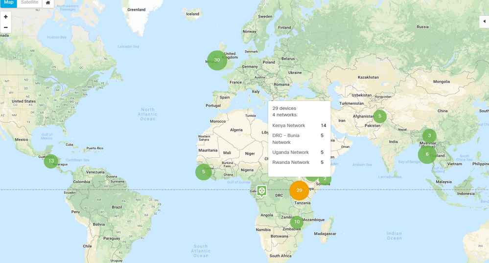
Looks like the Map display issue has been resolved - marker_id_xx now replaced with correct details for location.
Excellent work Team Meraki - looks great now, job well done 🙂
Gary
- Mark as New
- Bookmark
- Subscribe
- Mute
- Subscribe to RSS Feed
- Permalink
- Report Inappropriate Content
i think is is terrible before each network had a status light so you could quickly go to that network flick through the stack to see what the issue is, now with this new map you loose this feature and still have to go through multiple networks just to locate the issue. its a step back from what we had in my opinion.
- Mark as New
- Bookmark
- Subscribe
- Mute
- Subscribe to RSS Feed
- Permalink
- Report Inappropriate Content
Yep, see what you mean Shanec 😞
Have to agree with that, albeit it it's an improvement over the marker_id_xx issue - lol.
There should be an indication and clickable link on which network has a device in error state that takes you straight to that network/device, although if you have the Network tab of the table visible on the right of the screen, this takes you directly to the relevant alerting network, but if you have a shed load of networks, then viewing them all could be a problem.
8/10 Meraki Team, think about it from a users points of view not a devs viewpoint 🙂
Gary
- Mark as New
- Bookmark
- Subscribe
- Mute
- Subscribe to RSS Feed
- Permalink
- Report Inappropriate Content
Another update/addition to this regarding icons on the Map view - they don't appear until you do a zoom operation now 😞
-
Administrators
237 -
Change log
14 -
Firmware upgrades
31 -
Inventory
48 -
Licensing
78 -
Meraki mobile app
12 -
Other
174


