Community update: New profile layout & other improvements

CarolineS
Community Manager

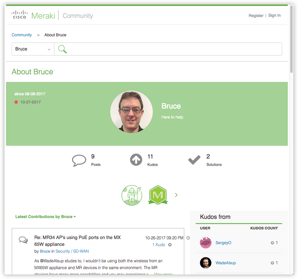
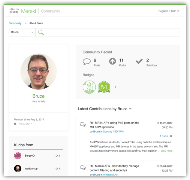
The Meraki Community team is excited to announce that we’ve just launched an improved Community profile! The new design:

  • uses space more efficiently than the original profile did,
  • displays your name / location / URL if you've set them (via My Settings > Personal > Personal Information),
  • provides a better location for community badges (which, shh, we’ll be launching more of soon!), and
  • looks great on mobile devices.

Before

After

profile-old.png bruce-new.png


We’ve also made a number of other small UI tweaks. Add a comment here if you spot one (and I just may send you some fun swag as a small prize for your eagle eyes!)


Cheers!

10 Comments
MilesMeraki
Head in the Cloud

The new look and feel its great @CarolineS! I look forward to the release of the community badges!


A few things which I've noticed with the updates to the UI, not too sure if these are all new features however definitely jumping out at me 🙂


  • The new Cisco Meraki footer on the bottom of the community page with quick links to Meraki blog, developers, jobs, community guidelines, privacy and terms of use, Youtube and Twitter! 
  • The search bar at the top back of the community allowing you to search within all community, blog, users, private messages.
  • Related documentation different thread categories (e.g Security/SD-WAN) thread has a sub-section for related documentation with hyperlinks to the Meraki documentation for relevant help articles.
  • Labels different thread categories (e.g Security/SD-WAN) thread has a sub-section for Labels with hyperlinks to certain tagged threads.
  • The ability to share certain posts/community updates with other social media accounts, i.e the one from you above allows me to share with my LinkedIn, Twitter, Facebook social media accounts at the click of a button!

Loving the new look and feel of the new UI 🙂


Mr_IT_Guy
A model citizen

I might be completely off base here, but on the home page it used to just say select a product to get started. Now I noticed that there is an other topics section under that. Before I would scroll down to click on Off the Stack.

CarolineS
Community Manager

@MilesMeraki - Glad you love it! All the things you mentioned were also present before our launch last night, but I definitely agree they're all useful features 😀


@Mr_IT_Guy - I did add a link to "Off the Stack" in the header a couple weeks ago! 


The things we changed last night are along the lines of "The title of the thread on each reply is less annoyingly large" 

MilesMeraki
Head in the Cloud

Haha, I need to pay more attention!  

Mr_IT_Guy
A model citizen

Is it that there's no more title when you reply to a post? Didn't that used to be a thing?


Also, I noticed in the list of topics that if the post has a picture, there's an icon now. Is that new? 

CarolineS
Community Manager

@Mr_IT_Guy - I'm pretty sure I removed the title-when-reply-to-post a while ago, and there has always been an icon when the post has a picture! Nice try though. 😛


I'm finding it really funny how ya'll who are here every day aren't noticing the little visual tweaks. At least those little adjustments make ME happy, if nobody else! 

Mr_IT_Guy
A model citizen

We certainly do appreciate the adjustments as I'm sure they are making our lives easier without us realizing it 🙂


So I noticed that in this thread there is no title-when-reply-to-post but others they are smaller font and bold. Didn't it used to be a Greenish color? (I'm committed to finding the little adjustments that have been made). Also, do Message tags look different too? It used to be just the word, but now it's a little bubble, right?

CarolineS
Community Manager

@Mr_IT_Guy - You're right about the smaller font and bold on the titles! It did used to be huge and green (edit: It used to be larger and black, not green! D'oh!). 


The message tags are actually unchanged - the ones you're seeing with the little bubbles are "labels" (basically, pre-configured tags).


But big bonus points for noticing the title thing! 😄


CarolineS
Community Manager

Here are a few of the minor adjustments we made, for the curious (there are at least 2 of you 😛  - @Mr_IT_Guy, @MilesMeraki😞

  • The green bar at the top of the site and the footer now stretch across the entire browser width (previously, they stopped at a fixed width)
  • On the home page:
    • The black bar behind the product images stretches across the entire browser width (previously, it stopped at a fixed width)
    • The big grey bars behind the "Category" level items (e.g. "Product & Technology Discussions") are gone, and the icons below those have changed to green
  • We removed the big chunk of whitespace below the titles of blog posts
  • We removed a lot of superfluous white space on thread pages, making it quicker to scroll through lots and lots of replies
  • On mobile, the "Register" link isn't awkwardly on its own line any more

Minor tweaks, for sure. But, they make our design team and me happy, and hopefully make the community experience just a bit smoother for everyone!

MilesMeraki
Head in the Cloud

Minor tweaks however small steps to perfection 🙂 Thanks for the update @CarolineS 🙂