Ya'll! Two small changes that hopefully make you smile (and that make the content a bit easier to scan):
(1) Thread page layout adjustments
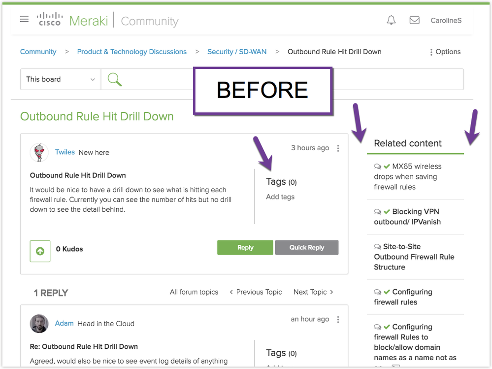
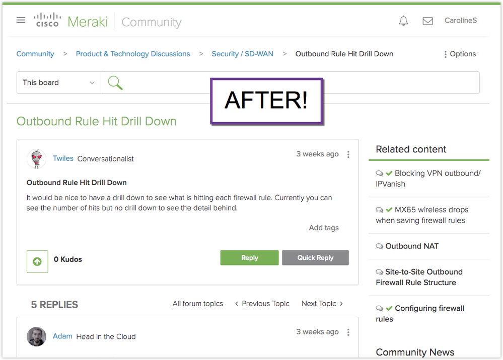
In response to the feedback from our last round of community front-end tweaks, we've just adjusted the layout on thread pages:
(a) Tags now appear below the content instead of to the right
(b) Less padding around the right column (Related content / Community News)


(2) Signature styling
To further help distinguish signatures from content, they now use a small dark-grey font by default. Additionally, any images you include in your signature will show up inline (instead of as a display:block element on the next line). My signature - including the twitter icon - is now created without any additional styling.
Signature:

Code:
Caroline S | Community Manager, Cisco Meraki | <img src="https://meraki.cisco.com/img/footer/twitter.svg" ><a href="https://twitter.com/merakicaroline" target="_blank">@merakicaroline</a><br><i>New to the community? <a href="https://community.meraki.com/t5/Community-Tips-Tricks/bd-p/getting-started">Get started here</a></i>
I'm really happy with these little adjustments; let us know what you think!