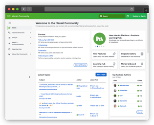
You may have noticed that things have changed around here!
| Previous community home page |
New community home page |
 |
 |
We are excited to launch our new look and feel, which uses Cisco’s new design system. This should feel familiar, since it’s the same design system as the Meraki dashboard.
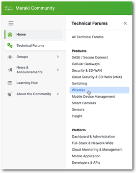
The biggest change, functionality-wise, is the left navigation, which is now always visible on the left side, with flyout menus for some navigation items. Note that you can condense the navigation by clicking the hamburger menu just below the community logo.
| Previous community navigation |
New community navigation |
 |

|
Another functional change is that the search in the header now always searches the entire community. Previously, if you were in a particular forum or blog, the search would default to that forum or blog. Now it defaults to the entire community, which we have found to be more intuitive behavior.
Other than the navigation and the search behavior, the community functionality is the same.
We hope you like the new look and feel - though we know a change this big may take some getting used to!
Tell us your thoughts in the comments below. For bug reports or more extensive feedback, please add to the feedback thread.
P.S. No, there isn’t Dark Mode - yet! I know you’ll ask. Plans are in the works... stay tuned!