Get answers from our community of experts in record time.
Join now- Technical Forums
- :
- Dashboard & Administration
- :
- Re: Dashboard login on a mobile fixed
Dashboard login on a mobile fixed
Solved- Subscribe to RSS Feed
- Mark Topic as New
- Mark Topic as Read
- Float this Topic for Current User
- Bookmark
- Subscribe
- Mute
- Printer Friendly Page
- Mark as New
- Bookmark
- Subscribe
- Mute
- Subscribe to RSS Feed
- Permalink
- Report Inappropriate Content
Dashboard login on a mobile fixed
The mobile login experience for me has now been fixed. In place of the screen that you had to scroll right on, you now have a nice simple login form.
Thank you dev team!
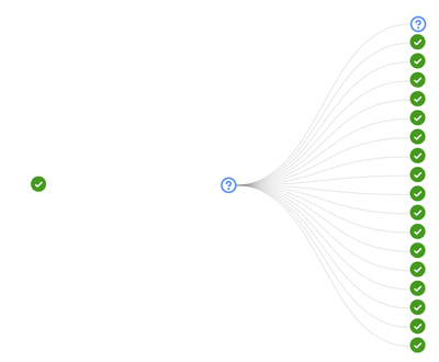
And in case people are asking why I am using the dashboard on a mobile, the new topology view does not render at all well in Microsoft Edge (for me), but works fine on the mobile (in Chrome)...
Solved! Go to solution.
- Mark as New
- Bookmark
- Subscribe
- Mute
- Subscribe to RSS Feed
- Permalink
- Report Inappropriate Content
I realised that if you zoom in, you get the expected icons 🤦🏻
- Mark as New
- Bookmark
- Subscribe
- Mute
- Subscribe to RSS Feed
- Permalink
- Report Inappropriate Content
This is what Edge give you...
- Mark as New
- Bookmark
- Subscribe
- Mute
- Subscribe to RSS Feed
- Permalink
- Report Inappropriate Content
Actually, the mobile only gives me something sensible for 1-2 networks, perhaps if I wait a while it will fix itself!
- Mark as New
- Bookmark
- Subscribe
- Mute
- Subscribe to RSS Feed
- Permalink
- Report Inappropriate Content
I realised that if you zoom in, you get the expected icons 🤦🏻
- Mark as New
- Bookmark
- Subscribe
- Mute
- Subscribe to RSS Feed
- Permalink
- Report Inappropriate Content
I thought Edge was only preinstalled so you could then download Firefox or Chrome.
- Mark as New
- Bookmark
- Subscribe
- Mute
- Subscribe to RSS Feed
- Permalink
- Report Inappropriate Content
I prefer to manage one set of vulnerabilities rather than two or three 😉
-
Administrators
238 -
Change log
15 -
Firmware upgrades
31 -
Inventory
48 -
Licensing
79 -
Meraki mobile app
12 -
Other
176

