- Technical Forums
- :
- Wireless
- :
- Re: Map Bubble Color
Map Bubble Color
- Subscribe to RSS Feed
- Mark Topic as New
- Mark Topic as Read
- Float this Topic for Current User
- Bookmark
- Subscribe
- Mute
- Printer Friendly Page
- Mark as New
- Bookmark
- Subscribe
- Mute
- Subscribe to RSS Feed
- Permalink
- Report Inappropriate Content
Map Bubble Color
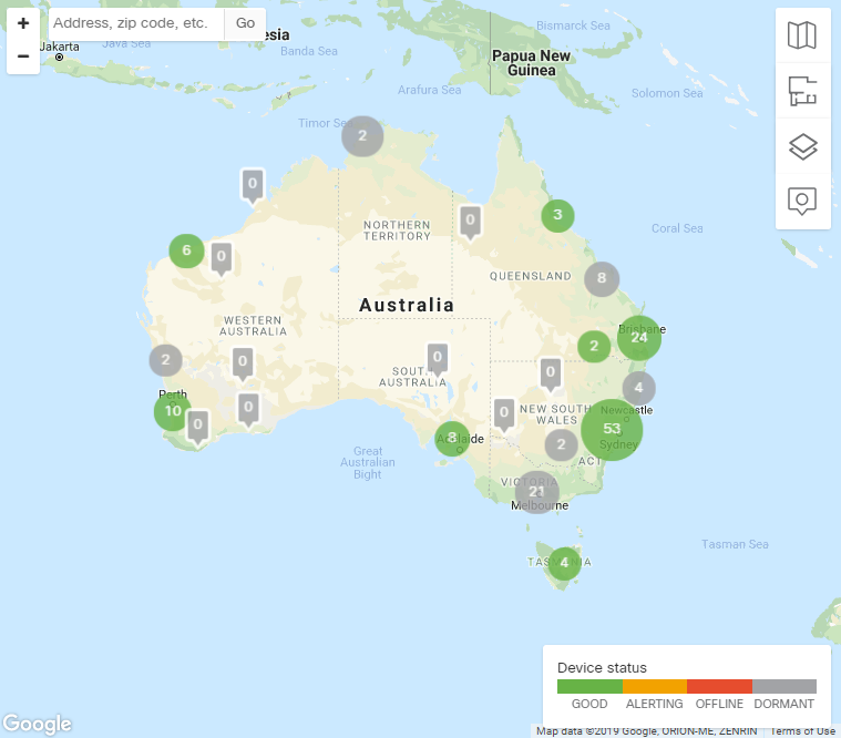
On the Cisco Meraki Dashboard, I can view a map that displays where my access points are located with a color showing their status. When I zoom out, it groups access points together in colored bubbles with the quantity of access points as a number inside (see below):
This map is misleading as the green bubble indicate that all access points are good. But if I drill down I can see that many of them are another color or status. The bubble should indicate how many are of each status, and show the color in stripes or shades gather than all green.
Why don't the bubbles show the color and quantity correctly? Can this be fixed to give us a better indication of where a problem may reside?
- Mark as New
- Bookmark
- Subscribe
- Mute
- Subscribe to RSS Feed
- Permalink
- Report Inappropriate Content
I agree.
Or at least not use green when something inside of it is not green.
- Mark as New
- Bookmark
- Subscribe
- Mute
- Subscribe to RSS Feed
- Permalink
- Report Inappropriate Content
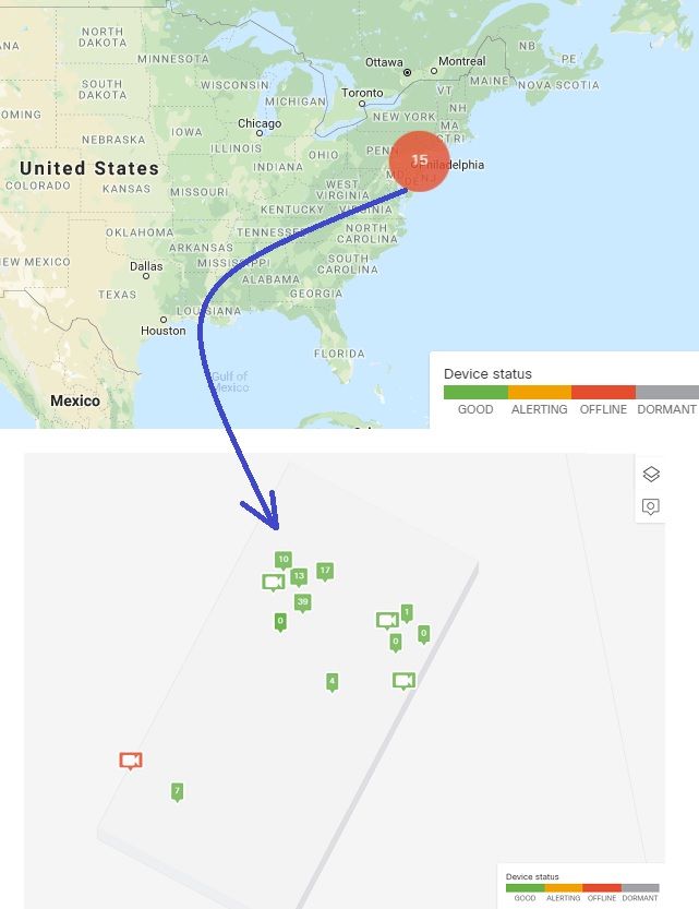
I would open a ticket on this. It works for me as you would want it to. I just took one single device offline in my home lab, So there's only 1 device, a camera, offline out of 15 devices. I have a RED circle, and when I click into the circle, I then see the one camera in red and all others in green. See attached. I'd open a ticket to investigate an apparent inconsistency in how this is being indicated in your own UI.
- Mark as New
- Bookmark
- Subscribe
- Mute
- Subscribe to RSS Feed
- Permalink
- Report Inappropriate Content
@MerakiDave I am not a fan of this design. It makes it look like there are 15 devices offline when zoomed out. I feel like there should be either separate bubbles next to each other or multiple lines of text on the bubble that indicate the different statuses.
- Mark as New
- Bookmark
- Subscribe
- Mute
- Subscribe to RSS Feed
- Permalink
- Report Inappropriate Content
I'm sure the intention is to keep the zoomed-out view as simple/clean as possible, but I agree that can give the impression 15 devices are offline (in the zoomed-out view) even though it's only 1 device. I will investigate if this is something that might be in the works, or if they need a feature request I'll get one created. It would be nice if when I hover over the red circle with the "15" in it, I at least get a pop-up with the number of online/offline device counts. Like when you're zoomed-in and hover over a device, you see a link to the device, it's recent usage, # of clients, camera thumbnail image, etc.
When zoomed out, I'm thinking multiple bubbles might get messy. I'd like to see either multiple numbers in a single bubble perhaps with a "online/offline/alerting/dormant" format, or perhaps a single number like it shows now, but hover over it and see a pop-up with the breakdown of each status. Thoughts?
- Mark as New
- Bookmark
- Subscribe
- Mute
- Subscribe to RSS Feed
- Permalink
- Report Inappropriate Content
I agree with keeping it simple. Having too much information in one circle will make it too cluttered. But the hovering idea seems like a good one.
What would also be good if there were a possibility to exclude a specific device/site from the analysis. So that if you know about a specific problem with a device you can exclude it, kind of like an "acknowledge". So you're not ignoring a specific orange/red circle assuming it's that device you know has issues while it's actually a different issue. Again maybe notifying in the hover menu that X devices are excluded (so you don't forget to re-include it after the problem's been fixed).
- Mark as New
- Bookmark
- Subscribe
- Mute
- Subscribe to RSS Feed
- Permalink
- Report Inappropriate Content
I agree on the multiple bubbles being messy but there should be at least multiple numbers listed for # of OK devices and # of erroring devices.I am ok with the color of the bubble remaining the color of the worst error.
- Mark as New
- Bookmark
- Subscribe
- Mute
- Subscribe to RSS Feed
- Permalink
- Report Inappropriate Content
Agreed. And I like the idea @BrechtSchamp about the ability to acknowledge a device that you know is offline, perhaps with the ability to ignore that fact for a day or a week (for example) such that the bubble goes green (despite any acknowledged offline devices) and then, should it go red again, you immediately know something else went down. Of course regular alerting can cover/supplement that, but I like the idea. That sounds a bit tricky, but I'll bring it up to the team.
My hope is (small steps) we have (or can get) something in the works for a pop-up when hovering over a bubble, or some kind of clear & concise format of the numbers in the bubble for online/offline/alerting/dormant devices.


