Get answers from our community of experts in record time.
Join now- Technical Forums
- :
- Wireless
- :
- Re: Doubt of graphs of the section Organization/Summary report
Doubt of graphs of the section Organization/Summary report
Solved- Subscribe to RSS Feed
- Mark Topic as New
- Mark Topic as Read
- Float this Topic for Current User
- Bookmark
- Subscribe
- Mute
- Printer Friendly Page
- Mark as New
- Bookmark
- Subscribe
- Mute
- Subscribe to RSS Feed
- Permalink
- Report Inappropriate Content
Doubt of graphs of the section Organization/Summary report
Greetings members of the community!
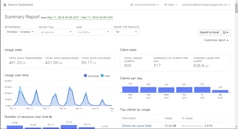
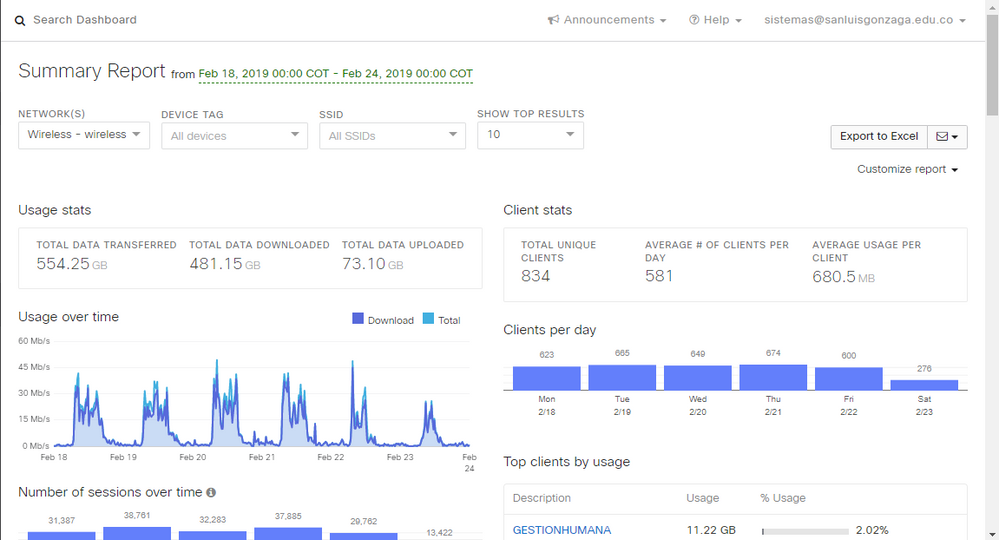
I have a particular doubt that I have not been able to resolve. It turns out that in the "Organization / Summary report" section, the "Usage over time" graphs appear. If I take 2 weeks where week 1 had wireless connectivity problems and week 2 were all problems solved; Why is it that the graph that corresponds to week 2 the peaks are more erratic where everything worked correctly?
Basically the changes that were made were of policies in the different VLANs, all APs were placed in an exclusive VLAN for them with their respective policies, unnecessary SSIDs were removed in the different APs, a large number of clients were placed in a SSID in NAT mode with its own policies.
I remain attentive to any collaboration and thank you very much!


Solved! Go to solution.
- Mark as New
- Bookmark
- Subscribe
- Mute
- Subscribe to RSS Feed
- Permalink
- Report Inappropriate Content
I checked one of my own organizations and I see the same behavior (more jagged lines in the report for Feb 18 - Feb 24). I didn't make any WiFi configuration changes in your two time periods.
My guess is that Meraki stores usage data at a high resolution for a limited period of time and keeps lower resolution usage data available for a longer period. It feels like they are using 30 days at the approximate cutoff.
In a few quick tests, I found that the summary report showed higher resolution usage data whenever the start date of the report was within the last 30 days. Any older than that and the entire usage data plot showed lower resolution data.
Again, just a guess so check it out for yourself and see if you agree.
- Mark as New
- Bookmark
- Subscribe
- Mute
- Subscribe to RSS Feed
- Permalink
- Report Inappropriate Content
- Mark as New
- Bookmark
- Subscribe
- Mute
- Subscribe to RSS Feed
- Permalink
- Report Inappropriate Content
- Mark as New
- Bookmark
- Subscribe
- Mute
- Subscribe to RSS Feed
- Permalink
- Report Inappropriate Content
I checked one of my own organizations and I see the same behavior (more jagged lines in the report for Feb 18 - Feb 24). I didn't make any WiFi configuration changes in your two time periods.
My guess is that Meraki stores usage data at a high resolution for a limited period of time and keeps lower resolution usage data available for a longer period. It feels like they are using 30 days at the approximate cutoff.
In a few quick tests, I found that the summary report showed higher resolution usage data whenever the start date of the report was within the last 30 days. Any older than that and the entire usage data plot showed lower resolution data.
Again, just a guess so check it out for yourself and see if you agree.
- Mark as New
- Bookmark
- Subscribe
- Mute
- Subscribe to RSS Feed
- Permalink
- Report Inappropriate Content
That's why I assume it's not just a coincidence. Anyway many cries for their answers!
- Mark as New
- Bookmark
- Subscribe
- Mute
- Subscribe to RSS Feed
- Permalink
- Report Inappropriate Content
It would be to wait to see who else gives us an answer or it would be on this side.
Thank you!
- Mark as New
- Bookmark
- Subscribe
- Mute
- Subscribe to RSS Feed
- Permalink
- Report Inappropriate Content
I think @HodyCrouch is right. For me the graph changes from detailed to more averaged as soon as I include March 13th into the time period. Which is the one month border for the graph at this point in time. Likely the resolution of the data for that day (and those before) is lower, so the whole graph's resolution is adapted to that lower resolution as soon as you include a date that's more than 1 month in the past.
- Mark as New
- Bookmark
- Subscribe
- Mute
- Subscribe to RSS Feed
- Permalink
- Report Inappropriate Content
Until a next opportunity... Regards!
