We're migrating to the Cisco Community on March 29. The Meraki Community will enter read-only mode starting on March 26.
Learn more- Technical Forums
- :
- Mobile Device Management
- :
- Re: [BUG] MDM settings - new UI
[BUG] MDM settings - new UI
Solved- Subscribe to RSS Feed
- Mark Topic as New
- Mark Topic as Read
- Float this Topic for Current User
- Bookmark
- Subscribe
- Mute
- Printer Friendly Page
- Mark as New
- Bookmark
- Subscribe
- Mute
- Subscribe to RSS Feed
- Permalink
- Report Inappropriate Content
[BUG] MDM settings - new UI
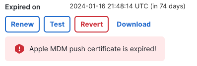
I just encountered a bug on the new UI for MDM settings under
Organization > MDM
For me it says, the push certificate is expired, if I change back to old UI everything is fine
Solved! Go to solution.
- Labels:
-
ADE
-
Enrollment
-
iOS
-
macOS
-
VPP
- Mark as New
- Bookmark
- Subscribe
- Mute
- Subscribe to RSS Feed
- Permalink
- Report Inappropriate Content
All sorted now @beks88_ - thank you again for the heads up! Should you continue to have any issues please drop me a DM.
- Mark as New
- Bookmark
- Subscribe
- Mute
- Subscribe to RSS Feed
- Permalink
- Report Inappropriate Content
Thanks for flagging @beks88_ , I see the same on my org so I'll file a bug report internally.
- Mark as New
- Bookmark
- Subscribe
- Mute
- Subscribe to RSS Feed
- Permalink
- Report Inappropriate Content
Engineering are taking a look at this now and it should be resolved soon, as soon as I've been given the heads up I'll let you know - thanks again @beks88_ for the heads up!
- Mark as New
- Bookmark
- Subscribe
- Mute
- Subscribe to RSS Feed
- Permalink
- Report Inappropriate Content
Here to help improve 🙂
- Mark as New
- Bookmark
- Subscribe
- Mute
- Subscribe to RSS Feed
- Permalink
- Report Inappropriate Content
All sorted now @beks88_ - thank you again for the heads up! Should you continue to have any issues please drop me a DM.
- Mark as New
- Bookmark
- Subscribe
- Mute
- Subscribe to RSS Feed
- Permalink
- Report Inappropriate Content
I'll add this one to this thread @ConnorL
Can you paint the "Remove" button in red? 🙂
- Mark as New
- Bookmark
- Subscribe
- Mute
- Subscribe to RSS Feed
- Permalink
- Report Inappropriate Content
Hey @beks88_,
Looking at all the other "Remove" buttons I can find on the new magnetic view (such as the Switches, Access Points, Cameras pages) they also do not use the colour red for the remove button. Let me ask the team if they plan on changing this, or if there's another reason behind this (might be a UX decision).
- Mark as New
- Bookmark
- Subscribe
- Mute
- Subscribe to RSS Feed
- Permalink
- Report Inappropriate Content
Thanks for the reply, the Apple ADE servers is using red indeed 🙂
I was also just wondering if it's a UX decision or something just missed


