Get answers from our community of experts in record time.
Join now- Technical Forums
- :
- Full-Stack & Network-Wide
- :
- Re: Where can I find Peak Bandwidth Usage Up and Down?
Where can I find Peak Bandwidth Usage Up and Down?
- Subscribe to RSS Feed
- Mark Topic as New
- Mark Topic as Read
- Float this Topic for Current User
- Bookmark
- Subscribe
- Mute
- Printer Friendly Page
- Mark as New
- Bookmark
- Subscribe
- Mute
- Subscribe to RSS Feed
- Permalink
- Report Inappropriate Content
Where can I find Peak Bandwidth Usage Up and Down?
We are looking to switch our ISP for the school and I am trying to find where I can find details on our internet usage for both upload and download? Currently the school is on 150mbit for Fiber for both upload and download...but the replacement solution is more expensive and I only want to pay for what we actually need. I am having a hard time trying to figure this out in the Meraki dashboard. We have an MX-84 for our security appliance.
Any tips on what data I should be looking at to help determine this would be appreciated.
Dennis
- Mark as New
- Bookmark
- Subscribe
- Mute
- Subscribe to RSS Feed
- Permalink
- Report Inappropriate Content
Hi @dlevens,
I'm not sure if this is the best way or not, but it's fairly simple for me to see what prolonged peaks were at. On the Network wide > Clients page, I'll filter by "only security appliance clients" and over the specified amount of time (such as for the last 30 days). If anyone else has a better way to see this, I'm all ears.
Found this helpful? Give me some Kudos! (click on the little up-arrow below) and If my reply solved your issue, please mark it as a solution 🙂
- Mark as New
- Bookmark
- Subscribe
- Mute
- Subscribe to RSS Feed
- Permalink
- Report Inappropriate Content
Thanks @WadeAlsup this is close but it does not tell me upload vs download, it seems to aggregate both. I am trying to find upload vs download peaks.
- Mark as New
- Bookmark
- Subscribe
- Mute
- Subscribe to RSS Feed
- Permalink
- Report Inappropriate Content
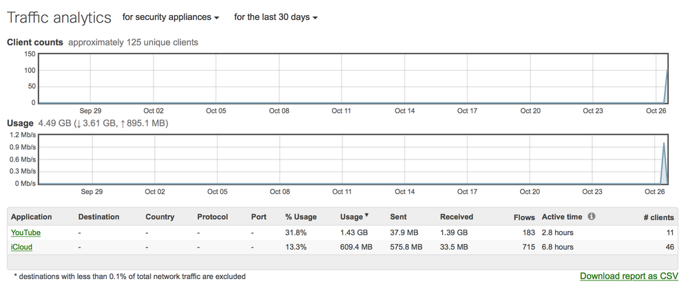
If you navigate to Network Wide --> Traffic Analytics and then change the drop down for 30 days that will show your the traffic. If you have other Meraki devices in your network, you'll have to select "for security appliances" as well.
Edit: I think for this to work you need to have Traffic Analysis turned on to basic at minimum in Network Wide --> General
- Mark as New
- Bookmark
- Subscribe
- Mute
- Subscribe to RSS Feed
- Permalink
- Report Inappropriate Content
@mmmmmmark I did have traffic analysis turned on but there is not much data here, and it too seems to aggregate upload and download.
- Mark as New
- Bookmark
- Subscribe
- Mute
- Subscribe to RSS Feed
- Permalink
- Report Inappropriate Content
If you had traffic analysis turned on since before today then there's something strange going on with the graphs as they should look more like this:

Edit: Ah, I see, you want the upload and download shown separately in the graphs... Don't think that is currently possible.
- Mark as New
- Bookmark
- Subscribe
- Mute
- Subscribe to RSS Feed
- Permalink
- Report Inappropriate Content
Found this helpful? Give me some Kudos! (click on the little up-arrow below) and If my reply solved your issue, please mark it as a solution 🙂
- Mark as New
- Bookmark
- Subscribe
- Mute
- Subscribe to RSS Feed
- Permalink
- Report Inappropriate Content
@WadeAlsup Thanks! I had stumbled across this while looking around and was about to post that this was the closest I had found to showing what I was looking for. It is unfortunate that this is only live data.
When the dashboard shows WAN in blue (does this in many areas) is that a total of both upload and download traffic across the WAN or is it upload only?
- Mark as New
- Bookmark
- Subscribe
- Mute
- Subscribe to RSS Feed
- Permalink
- Report Inappropriate Content
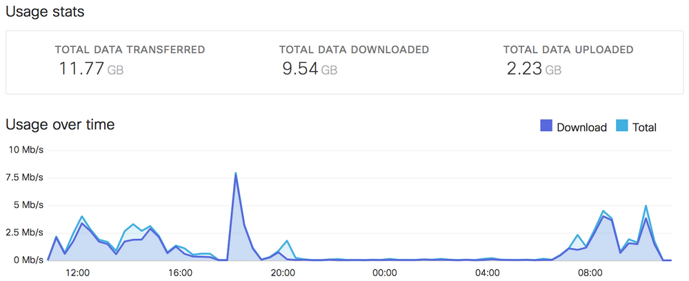
Looking at the legend, the dark blue is going to be download while the lighter blue color here is in total. I think I've done it before, but we should make wishes for upstream to be added in addition to these?
Security Appliance > Appliance Status > Uplink > Live Data > Uplink traffic
Found this helpful? Give me some Kudos! (click on the little up-arrow below) and If my reply solved your issue, please mark it as a solution 🙂
- Mark as New
- Bookmark
- Subscribe
- Mute
- Subscribe to RSS Feed
- Permalink
- Report Inappropriate Content
The chart in Organization > Summary Report seems to be my best option. It does show Download vs Upload and over time as well. Just wished you could make it larger and could adjust the scale (one spike can mess the scale up). Also wished it included Upload instead of Total or had a toggle for Upload, Download and Total.
- Mark as New
- Bookmark
- Subscribe
- Mute
- Subscribe to RSS Feed
- Permalink
- Report Inappropriate Content
@dlevens, I found it.
Organization > Summary Report and then filter on your MX for your site. You get a usage over time area. Make sure you are using the New Version of the page as well.
Found this helpful? Give me some Kudos! (click on the little up-arrow below) and If my reply solved your issue, please mark it as a solution 🙂
- Mark as New
- Bookmark
- Subscribe
- Mute
- Subscribe to RSS Feed
- Permalink
- Report Inappropriate Content
Yup, see my post above yours 🙂
- Mark as New
- Bookmark
- Subscribe
- Mute
- Subscribe to RSS Feed
- Permalink
- Report Inappropriate Content
@dlevens HAHA...I'm just overlooking all sorts of things today.
Found this helpful? Give me some Kudos! (click on the little up-arrow below) and If my reply solved your issue, please mark it as a solution 🙂
- Mark as New
- Bookmark
- Subscribe
- Mute
- Subscribe to RSS Feed
- Permalink
- Report Inappropriate Content
@WadeAlsup This is definitely the closest you'll get for historical average use, but they definitely filter out peak usage in that chart. The chart for one of my MXen shows a peak of about 600Mbps. This may well be the "average" for that MX of the time period, but it regularly goes above 1Gbps and sometimes much higher (upwards of 2.5Gbps).


