- Technical Forums
- :
- Developers & APIs
- :
- Re: API endpoint to build Connection Steps Graph (Meraki Dashboard -> Acces...
API endpoint to build Connection Steps Graph (Meraki Dashboard -> Access points -> Health)
- Subscribe to RSS Feed
- Mark Topic as New
- Mark Topic as Read
- Float this Topic for Current User
- Bookmark
- Subscribe
- Mute
- Printer Friendly Page
- Mark as New
- Bookmark
- Subscribe
- Mute
- Subscribe to RSS Feed
- Permalink
- Report Inappropriate Content
API endpoint to build Connection Steps Graph (Meraki Dashboard -> Access points -> Health)
I'd like to rebuild the connection steps graph from the meraki dashboard->access points->health page.
As far as I have seen the Meraki Dashboard API v1 endpoints for wireless connection stats by network (https://developer.cisco.com/meraki/api-latest/#!get-network-wireless-connection-stats or https://developer.cisco.com/meraki/api-latest/#!get-network-wireless-clients-connection-stats) should contain the data to fill the graph.
I tried to calculate the percentages of each connection step and compared them with the original connection step graph in the dashboard but was not able to receive the same results.
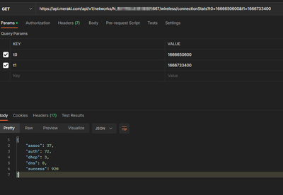
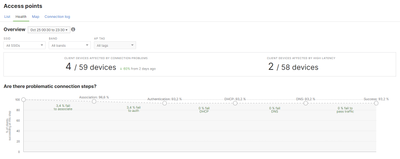
Here is an example of the response data of the network connection stats endpoint and the dashboard graph for the exact same timespan:
Am I missing some data to perform the calculation and receiving the exact same results or is the calculation more complex than just calculating (step failed attempts) / (total attempts) ?
- Mark as New
- Bookmark
- Subscribe
- Mute
- Subscribe to RSS Feed
- Permalink
- Report Inappropriate Content
No , this is currently bugged. I have an open case for many months.
If 1 device has 150 failed auths, the API will log them all , but the dashboard may only report 1 or way fewer.
I would suggest to open a case to put more pressure 🙂
- Mark as New
- Bookmark
- Subscribe
- Mute
- Subscribe to RSS Feed
- Permalink
- Report Inappropriate Content
thank you very much for the info!
I have compared some other data with the corresponding graph/table in the dashboard and found other occurrences where the data is far from equal (like ap latencies or device failed connections).
Guess I'll open a ticket for those ones too
- Mark as New
- Bookmark
- Subscribe
- Mute
- Subscribe to RSS Feed
- Permalink
- Report Inappropriate Content
I generally avoid trying to replicate what is seen in dashboard.
As well as issues like the one @RaphaelL mentions, there are some practical factors with trying to match anything quantitative...
- dashboard's method of calculation isn't published, you must infer/guess when trying to replicate
- dashboard may be using data that is not available via the API
- dashboard may be using data with different time resolution/bucketing
- is dashboard always doing the calculation on demand, or are some things cached for efficiency
- are the start/stop times dashboard uses the same as used in your calculation, when you operate across many time zones it can be unclear
- if you tell the customer that your report x is the same as dashboard report z, if there is any difference at all, it can destroy confidence in both, the natural perception will be that one (at least) is wrong
- etc.
In general, for performance analysis/comparison at scale, it is simpler to ignore dashboard, besides it would take too long to look at dashboard details for hundred of networks manually.
As long as our calculations based on API data are reasonably accurate (which does requires testing carefully!), we will use them for reporting and analysis. That is enough to identify any issues, then dashboard can be used to drill down to determine the cause and resolve it.
For wifi onboarding issues, we calculate from the API data across hundreds of sites for each AP and SSID, the resulting excel file has a few thousand rows, with filters/sorts it's then easy to identify any problems, some reports have code to traffic light cells with values out of range.
-
Bluetooth
13 -
Captive Portal API
33 -
Code Sample
131 -
Dashboard API
711 -
Getting Started
11 -
MQTT
2 -
MV Sense
9 -
Other
8 -
Python
16 -
Scanning API
78 -
Updates from Meraki
81 -
Webhooks
40 -
Webinars
11


