- Technical Forums
- :
- Dashboard & Administration
- :
- Re: Is an improvement of graphs possible?
Is an improvement of graphs possible?
- Subscribe to RSS Feed
- Mark Topic as New
- Mark Topic as Read
- Float this Topic for Current User
- Bookmark
- Subscribe
- Mute
- Printer Friendly Page
- Mark as New
- Bookmark
- Subscribe
- Mute
- Subscribe to RSS Feed
- Permalink
- Report Inappropriate Content
Is an improvement of graphs possible?
I would like to post a kind of feature request here. Call it "improvement of graphs".
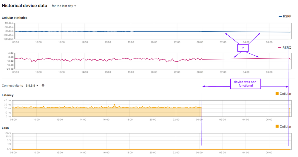
What bothers me is that some graphs are interpolated.
As an example: during a nightly outage of a MG21 (unfortunately, that happens now and then) one can see network traffic in the graph (that is obviously not here). Now that is quit clear, but it may be a really disturbing thing while troubleshooting a more complicated issue.
This is not only seen on MG graphs but also on other dashboard pages (switches, Accesspoints, MX's).
Besides this issue, regardless the selected time interval, graphs are calculated with the same amount of data. Most Meraki network usage graphs are far from detailed (even not in a 2 hour based interval), and perhaps better said: so undetailed they are almost unusable.
Graphs can be a great help to see anomalies and other issues, so I hope Meraki will improve the display of graphs to a real helpful level!
For the record: I'm writing this not to be angry or so, but in an attempt to get the Meraki life better for us all.
Greetings from Holland!
Alexander
- Mark as New
- Bookmark
- Subscribe
- Mute
- Subscribe to RSS Feed
- Permalink
- Report Inappropriate Content
@Duijv023 it just joins the datapoints with a straight line (apart from latency). I agree they should be consistent, but personally like the detail. Would you prefer that they all have a gap (like latency) or a straight line (like the rest)?
- Mark as New
- Bookmark
- Subscribe
- Mute
- Subscribe to RSS Feed
- Permalink
- Report Inappropriate Content
Hi,
For me, I would like to see a gap, or else datapoints at 0.
- Mark as New
- Bookmark
- Subscribe
- Mute
- Subscribe to RSS Feed
- Permalink
- Report Inappropriate Content
Yes, I'd rather see a gap than interpolation.
You can use the "Give your feedback" button at the lower right of the dashboard page to make the suggestion (used to be "Make a wish"), it may have better visibility.
-
Administrators
152 -
Android
1 -
Change log
11 -
Firmware Upgrades
22 -
Inventory
37 -
Licensing
53 -
Other
103 -
Security & SD-WAN (MX)
1


